The Rundown
- Conversion-centered design (CCD) is a deliberate strategy that encourages passive visitors to take action.
- CCD can be effective for landing pages, but it isn’t always the best approach for other webpages.
- Visual design principles like encapsulation, color and contrast, directional cues, and negative space work together to focus attention and make the next step visually obvious.
- Psychological drivers like urgency, free trials, and social proof reduce hesitation and create emotional motivation to convert.
- A/B testing and performance metrics like bounce rate and click-through rate help assess CCD effectiveness.
What is conversion-centered design? CCD is a science, an art form, and a deliberate strategy that aims to nudge passive users in the right direction, specifically, to complete a desired action.
When planning your landing page’s design for conversions, the goal is to provide a frictionless user experience that facilitates a seamless transition from visitor into buyer, client, subscriber, learner, applicant, or, more broadly, a participant in your desired outcome.
To convert effectively, landing pages must tick multiple boxes:
- Relevant
- Compelling
- Trustworthy
- Focused
- Visually Appealing
- Persuasive
- Urgent
- Clear
- Concise
- Authoritative
- Benefit-Oriented
In this comprehensive guide, we break down each of the seven principles of conversion-centered design into digestible, actionable steps that you can take to tip the odds in your favor.
Table of Contents
- 1 Frequently Asked Questions
- 1.0.1 What’s the difference between a conversion-centered landing page and a standard webpage?
- 1.0.2 How can I visualize the difference between a conversion-centered landing page and a homepage?
- 1.0.3 How is my design for conversions working?
- 1.0.4 How can I experiment with different CCD strategies?
- 1.0.5 Is CCD only for landing pages?
- 2 CCD Isn’t Always the Best Approach
- 3 The 7 Principles of Conversion-Centered Design
- 4 1. Encapsulation Creates a Tunnel Vision Effect
- 5 2. Color and Contrast Capture the Eye
- 6 3. Guiding Signals Point Visitors in the Right Direction
- 7 4. Negative Space Makes Messaging Pop
- 8 5. FOMO Creates a Sense of Urgency
- 9 6. Samples and Trials Entice Visitors to Convert
- 10 7. Social Endorsements Instill Trust
- 11 Contact Us for a Free Consultation
Frequently Asked Questions
What’s the difference between a conversion-centered landing page and a standard webpage?
Design for conversions is implemented with intention, utilizing visual cues and psychological factors to guide the user toward a specific outcome. Standard webpages typically encompass a broad scope of information and navigation options.
How can I visualize the difference between a conversion-centered landing page and a homepage?
Consider the difference between a short story and a Choose Your Adventure book. The short story (landing page) has a linear progression that leads to one conclusion; the Choose Your Adventure Book (homepage) allows the reader to follow their preferred path within the ecosystem.
What is conversion-centered design? It’s a one-way road for visitors to follow to a set destination: the conversion.
How is my design for conversions working?
Tracking and analyzing conversion rate, bounce rate, click-through rate, and other key performance indicators (KPIs) allows you to determine if your design is working. Google Analytics is a helpful tool for following these metrics and more.
How can I experiment with different CCD strategies?
Perform A/B testing, showing half of your audience one version and the other half another version. After a set amount of time, switch to the version that performed best.
Is CCD only for landing pages?
CCD is often referenced in the context of landing pages because these pages are standalone and inherently used for driving conversions.
However, the general elements of design for conversions, such as establishing trust, providing a clear and concise navigation path, and eliminating friction, can be applied to other webpages, apps, emails, and various digital marketing and web design strategies.
CCD Isn’t Always the Best Approach
It’s worth noting that CCD isn’t always the right strategy. For example, a homepage should offer multiple navigation options, allowing visitors to choose their path freely. At the same time, you can still encourage conversions without having them be the only option.
Take the Rainbow Symphony homepage, for example:
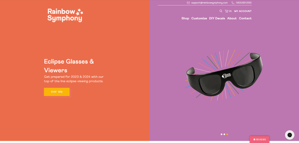
When you visit the homepage, you see a carousel of three products that automatically switch. The call-to-action (CTA) nudges visitors to shop these three popular products without actually forcing the conversion.
The homepage’s design for conversions also includes a wheel prize popup that encourages visitors to provide their email address in exchange for a spin:
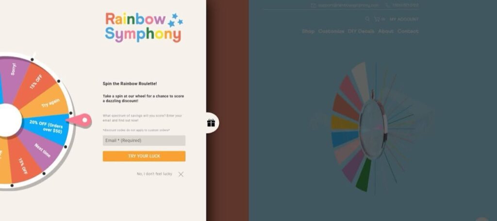
This optional interaction facilitates a conversion (providing an email address), but visitors can easily click away if they’re not interested.
What is conversion-centered design? On a landing page, it’s a very deliberate, singular path to one specific outcome. On other types of webpages, paths can lead to desired outcomes, but that’s not the page’s sole purpose.
The 7 Principles of Conversion-Centered Design
With all of that preliminary information out of the way, let’s get to the nuts and bolts of design for conversions.
First, we’ll highlight four design-specific UX strategies that focus on the visual side. Then, we’ll cover three psychological factors to incorporate into that design.
1. Encapsulation Creates a Tunnel Vision Effect
Effective CCD carves a clear, undeniable path from point A to B. The visitor knows exactly what step to take next with zero confusion.
For example, when we search Google for “netflix discounts,” the first result is a landing page:
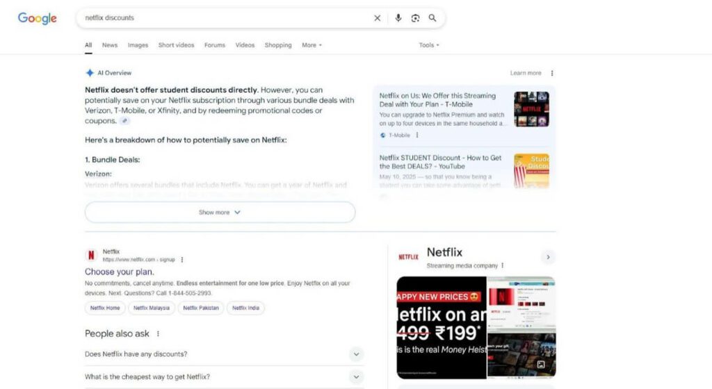
Netflix doesn’t offer discounts, so it utilizes SEO (search engine optimization) to capture the top spot and guide searchers to a signup landing page that employs design for conversions.
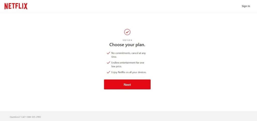
The landing page provides clear, concise information and one path forward. What is conversion-centered design? It’s a simple means to an end.
2. Color and Contrast Capture the Eye
According to Zippia, 94% of first impressions are related to web design, and 38% of visitors will stop engaging with an unappealing webpage.
Furthermore, visitors form an opinion about a website in 0.05 seconds, according to Forbes.
Presentation matters.
Colors evoke emotions, and in turn, inspire actions. Any web designer worth their salt knows that visual appeal isn’t everything. Consider the underlying message it’s sending subliminally.
For example, fiery hues like red and orange create an energetic mood that generates excitement. Calmer colors, such as blue and green, create a sense of comfort and calmness, fostering trust.
Design for conversions should also align with your branding and the overall ‘feel’ of your product or service. Pastels can provide a chic, inviting aesthetic for a women’s boutique apparel brand, but using the same color scheme for aftermarket motorcycle parts would hurt your conversion rate.
In addition to choosing colors and combinations with intention, consider the power of contrast as a way to direct eyes to your CTA. A pastel blue page with a neon orange CTA button leaves no questions about where to click.
3. Guiding Signals Point Visitors in the Right Direction
The seven principles of conversion-centered design aim to direct traffic in the right direction, so embrace cues that (often quite literally) point visitors to where they should go.
Design for conversions can include prominent arrows, underlined and bolded text, alternative colors, icons and symbols, subtle animations, and oversized elements. You could even use a stock image of a person looking suggestively in the direction of the CTA button.
With all of that said, don’t overdo it. What is conversion-centered design? It’s tasteful and not overly busy. You want to make the next move obvious, but you don’t want to overcrowd the landing page with mixed signals. It’s not about just catching the eye; you need to direct it.
4. Negative Space Makes Messaging Pop
Design for conversions should emphasize the visitor’s next step. We covered visual elements that make your message visible, but don’t overlook what’s not there as part of the equation. While you want visitors to feel motivated, you don’t want them to feel overwhelmed.
Negative space, white space…whatever you call it, the area surrounding the core visual elements should be distraction-free, allowing your messaging to stand out. The Netflix landing page above uses negative space very effectively. The bare-bones page shows the visitor exactly how to proceed.
5. FOMO Creates a Sense of Urgency
Now that we’ve covered web design for conversions from a visual perspective, let’s shift gears and focus on the intangible side of the seven principles of conversion-centered design.
What is conversion-centered design? It’s a comprehensive strategy that evokes an emotional response, leading to a physical action. A well-designed landing page can only take you so far. To achieve the elusive conversion, you must make the action compelling and attractive.
Urgency gets visitors’ neurons firing, strongly urging them to take the next step before it’s too late. Nobody wants to miss out on a great thing, so your design for conversions should capitalize on humans’ natural FOMO response.
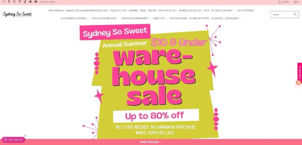
Creating a sense of urgency can be subtle. Let’s use Sydney So Sweet as an example.
Here, the phrase “while supplies last” is added tastefully, making it clear that the sale is only available for a limited time.
Taking the concept of subtlety even further, this sale uses the promo code “HURRY15” to imply that time is of the essence without saying so directly:
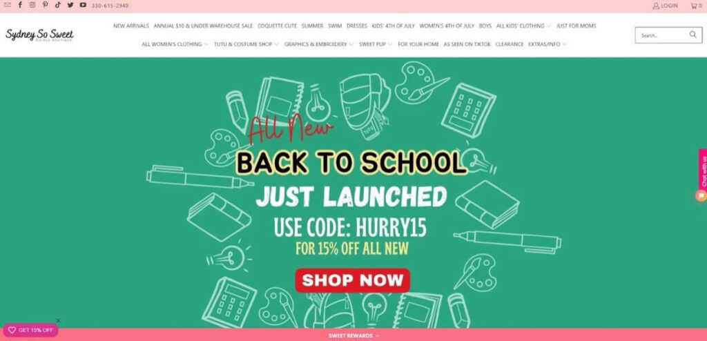
The goal is to make the conversion feel necessary without applying excessive pressure. Visitors don’t want to feel like they’re being manipulated. Practical design for conversion plants the seed, but allows visitors to decide if they wish that seed to grow ultimately. If you did your job right, the end conclusion should feel inevitable. The converter should feel like they won.
Need help applying these tactics to your landing pages?
6. Samples and Trials Entice Visitors to Convert
Everyone loves a freebie. What is conversion-centered design? It’s a way to engage visitors and inspire them to take action. What better way to get that conversion than by providing something of value at no cost?
Now, out of all of the seven principles of conversion-centered design, this one naturally carries the most risk, and it’s not ideal for every business. However, the ROI can be massive if you play your cards right.
As you plan your design for conversions, consider if you can provide a freebie that has a strong chance of leading to a profitable conversion. That doesn’t necessarily mean sending a free physical product, although that can be a powerful approach.
Signing up for a newsletter comes with the promise of a coupon. You could provide the first chapter of an audiobook for free. Maybe you let someone use your VPN app for 24 hours. The idea is to give visitors a taste that whets their appetite and encourages them to return for the whole meal.
CCD generally focuses on rapid turnarounds, but landing pages can generate leads that eventually convert into sales. When implementing web design for conversions, don’t overlook the bigger picture. Try to immediately trigger visitors’ base instincts while still providing long-term value that inspires them to return if they don’t convert this time around.
What is conversion-centered design? It’s casting a line and hoping for an immediate bite, but recognizing that fish aren’t always hungry.
7. Social Endorsements Instill Trust
Up to 98% of consumers depend on customer reviews when shopping online, according to Harvard Business Review.
As a business, you’re inherently an unreliable narrator. Even if your product or service is an incredible value, people will be skeptical until they experience it firsthand. Social proof provides that extra nudge that can push hesitant visitors over the edge.
Let’s use the design for conversions on the Coalition Technologies homepage as an example:
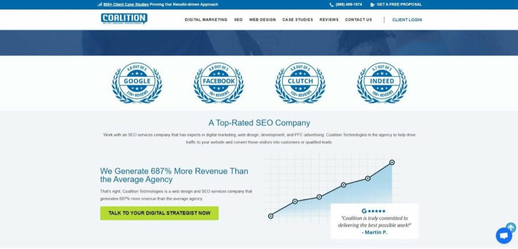
As the world’s top SEO agency, we get a ton of stellar client reviews. We ensured that visitors quickly gain a broad overview of our success rate. The page features icons highlighting our reviews on major platforms, along with a review snippet from one of our many satisfied clients.
Contact Us for a Free Consultation
These seven principles of conversion-centered design can be game-changers, but only if you implement them effectively. If your business needs landing pages that convert, let’s work together to develop a strategy. Contact us now for a free consultation about design for conversions.


